[Virtuelles Event] GenAI Streamposium: Lerne, Echtzeit-GenAI-Apps zu entwickeln und zu skalieren | Jetzt registrieren
Everything You Need to Know About Data Flow Design
Whether you’re mapping a computer network or drawing directions to your house, data flow design is a common activity that helps to visualize and understand the flow of information. Data flow refers to how information moves through a system, helping engineers to understand where and how data is enacted upon within a network.
What is Data Flow Design?
Data flow design is the act of mapping the flow of data, generally through the use of diagrams. Like a modern-day cartographer, the designer visually depicts what is being moved, how, and where. This information illustrates each aspect within a system where data lives or can be moved through. This design is used to model new systems and to examine existing ones.
Data flow diagrams use symbols, such as arrows, to indicate the direction of traffic, plus short-text labels to indicate inputs, outputs, and storage points. They’re popular due to their ability to convey information in an easily digestible manner to both technical and non-technical audiences. As visual creatures, humans rely on data flow diagrams to understand the flow of information within a system.

When to Create Data Flow Diagrams
Data flow diagrams can be used for numerous purposes, including:
-
Software engineering
-
Hardware installation
-
Business analysis
-
Agile development
-
System structures
In any case where the system needs to be explained, including proposing a new system and auditing an existing system, a data flow diagram can be helpful in conveying concepts. This includes presentations to the C-suite or stakeholders, requests for additional system assets, proposals of changes to existing systems, and auditing systems for regulatory compliance.
Designing a Data Flow Diagram
Data flow diagrams can be logical, physical, or a mix of the two.
Logical data flow diagrams show the theoretical flow of information, including:
-
Where the data comes from
-
How the data moves through a system
-
How the data may be changed during its journey
-
Where the data ends up
Physical data flow diagrams show the actual flow of data through a network, including:
-
Specific system hardware and software
-
How files, employees, and customers alter data
-
Origin and end points for the data
There are four main notations of a data flow diagram and four main representations for each notation.
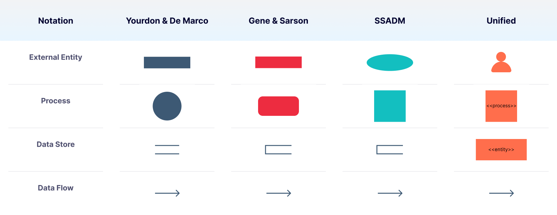
External Entity
External entities, drawn around the margins of the data flow diagram, represent outside systems that send information into or out of the network being diagrammed. Represented by circles or rectangles, or a stick figure in the case of the Unified style, these outside actors only exist in the diagram to show information flowing inward or outward. As they aren’t part of the system displayed, they don’t require additional information beyond the identification of what they are.
Data Store
Expressed by parallel lines or an open rectangle, except in the case of the Unified style, the data store identifies storage systems in which data rests. It’s named with a plural because it derives data to and from this location. A data store can be thought of as a warehouse or filing cabinet—data flowing from the data store represents data which lives there and is being accessed or sent elsewhere. In other words, data inputs flow through a process and then through a data store, while data outputs flow out of a data store and then through a process.
Data Flow
Data flow represents the direction in which data is traveling within the system. This is universally represented by a line with an arrow pointing in the direction of the flow. While a one-word label can be used as needed, the arrow is the primary indicator of flow and direction.
Diagram Requirements
Every data flow diagram should include at least one input and at least one output. The system’s stored data must go through a process, which means there must be data flowing in and data flowing out. Additionally, all processes must link to another process or data store.
Data Flow Examples
Data flow diagrams vary in detail depending on the scope of the system and the complexity being communicated via the diagram. In general, the simplest form of data flow diagram is a Level 0 diagram.
Level 0 data flow diagrams, also called context diagrams, convey high-level information about a system. It’s a basic overview of a system or design, intended to be understood by non-technical audiences such as business analysts. As the levels increase, they become progressively more detailed in scope and drilled down to specific data stores and processes. A Level 3 data flow diagram is highly unusual, as the complexity required for it defeats the purpose of the diagram—which is to simplify a process for ease of consumption by non-technical audiences.
Level 0 Data Flow Diagram Example
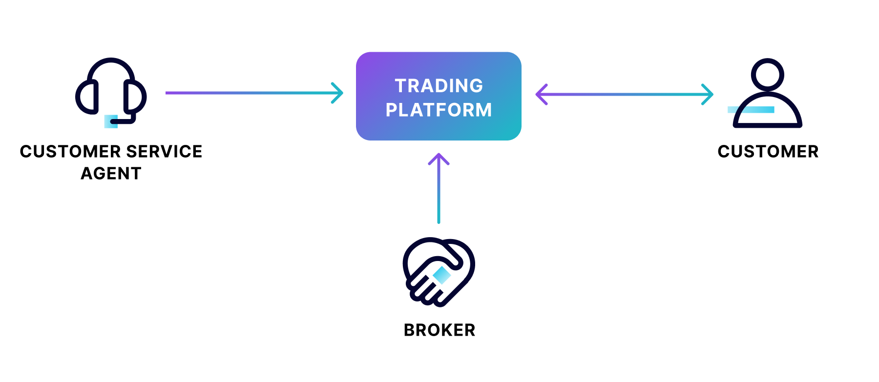
In the above example of a securities trading software, data flows in one direction from the broker and the customer service agent to the trading platform data store. Data flows in both directions between the customer and the trading platform.
Level 1 Data Flow Diagram Example
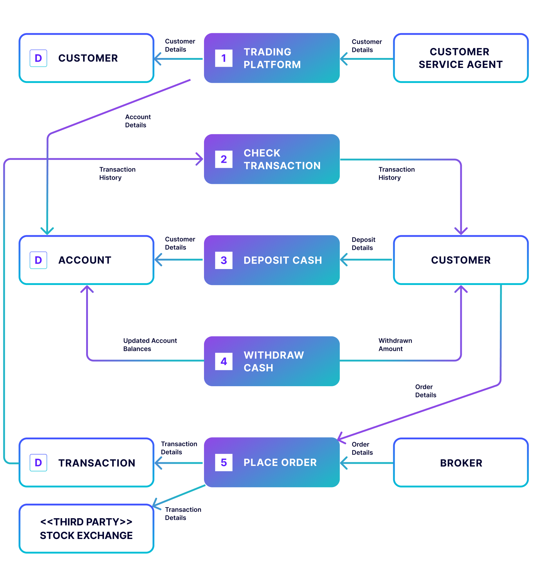
The Level 1 version of this securities trading software breaks the processes into more detail, highlighting the main functions carried out by the system.This allows viewers to understand the process in its entirety, including the types of transactions the customer can engage in. Level 1 is the most common type of data flow diagram used.
Level 2 Data Flow Diagram Example
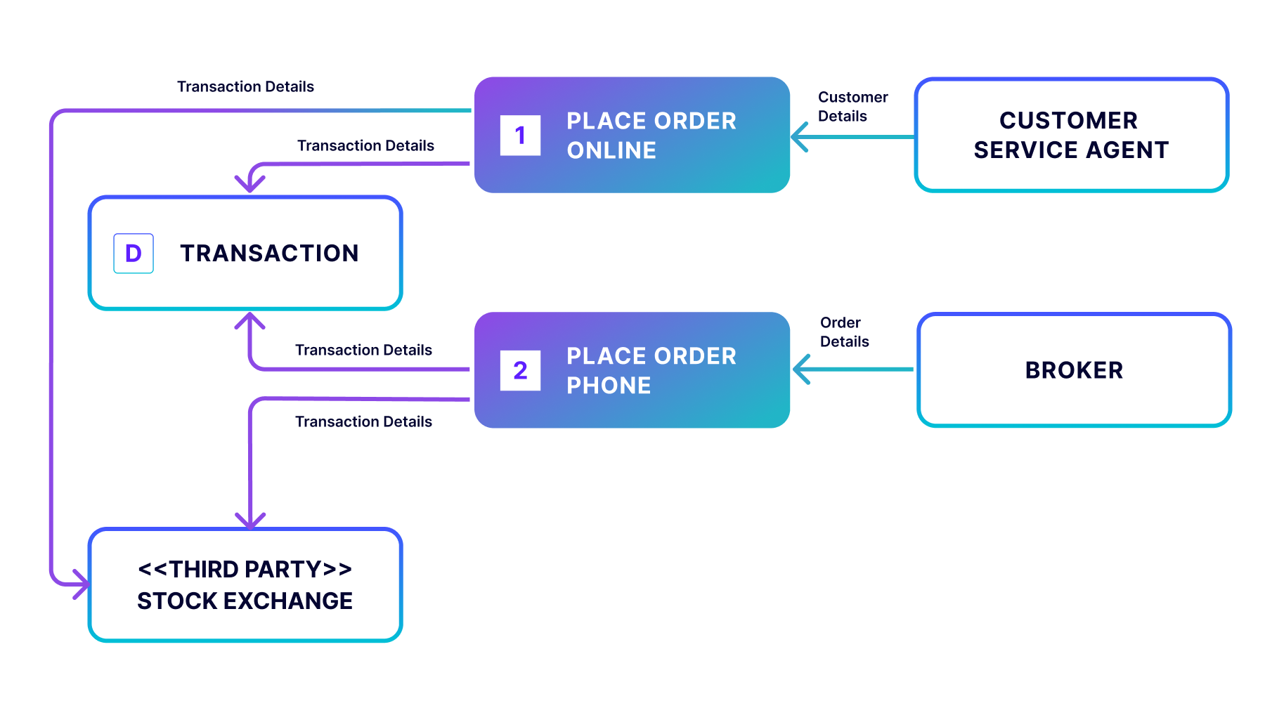
In the Level 2 data flow diagram, a more granular depiction of a specific process is the goal. In this case, the “Place Order” process is the piece we’re focusing on with the inclusion of the external entity stock exchange. Although the diagram is less busy than in Level 1, it’s a zoom-in on a specific part of the process, and therefore, a Level 2.
Level 3 Data Flow Diagram Example
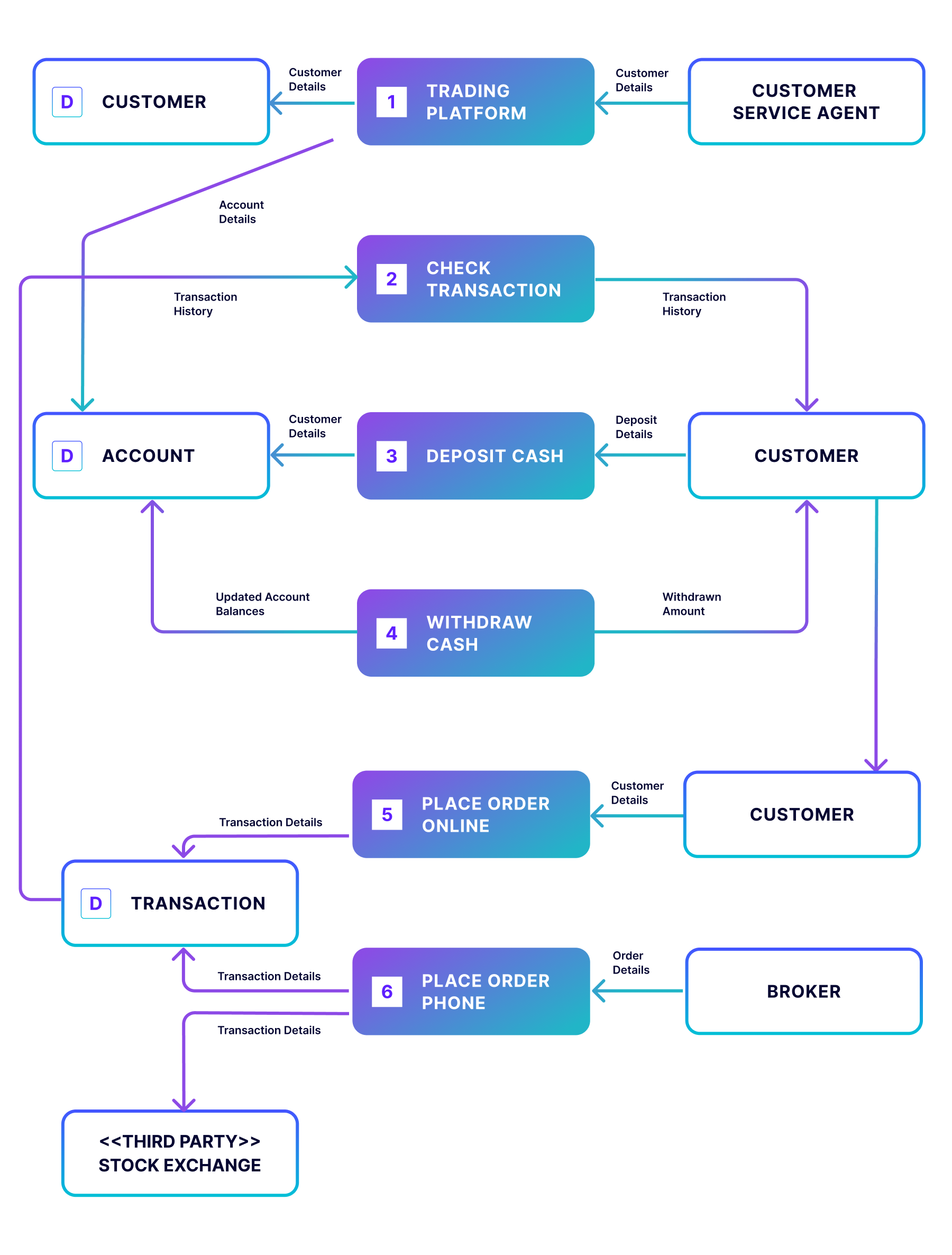
In the less-common Level 3 data flow diagram, the specific process of “Place Order” is further expanded to show the options available when placing an order online, such as purchasing, selling, and transferring. As you can imagine, this level of detail for the entire process becomes text-heavy and difficult to read. Thus, this level is generally reserved for activities such as mapping out new networks, most often performed by qualified system engineers.
Tools and Programs for Designing Data Flow Diagrams
You can use a variety of tools to craft a data flow diagram, including Adobe Acrobat. The following tools can also help you get started with your data flow diagram:
Additionally, fully managed Flink in Confluent Cloud produces data flow diagrams to model every phase of the data flow and how data is processed in real-time streaming functionalities. In this way, constructing the diagrams allows the design of effective data flow systems to achieve highly reliable and easily scalable results.
How Confluent Can Help
Building complex data flows capable of processing and governing data in real time is challenging enough, but these days, most developers are expected to build their organization’s mission-critical applications and services in the cloud. Many companies that have modernized their data flows have realized just how much time and attention it takes to deploy, monitor, and manage the distributed data streaming engine in the cloud.
Confluent Cloud, a fully managed Kafka service powered by Kora, offers these organizations a way to spend more time building and leveraging modern data pipelines. With Confluent as a central data hub, you can scale real-time data capture and processing from heterogeneous data sources in any environment to your cloud database, so your applications are always powered by the most up-to-date data.
See a demo on how to use Confluent Cloud for streaming data pipelines, and get started with Confluent for free.